Sakura Creative - Branding
Learning Outcomes Legend
Learning Outcome 1 - Conceptualize, design, and develop interactive media products
Learning Outcome 2 - Transferable production
Learning Outcome 3 - Creative iterations
Learning Outcome 4 - Professional standards
Learning Outcome 5 - Personal leadership
Learning Outcomes Achieved in this project
Learning Outcome 1 - Designing the Brandbook from the ground up - from sketches, to final product
Learning Outcome 3 - Iterating on design elements and decisions based on feedback from colleagues, teachers. Feedback was used to improve and develop the product to its final state.
Learning Outcome 4 - Prior research was conducted to see what professionals in the field make. Our designs sit on top of that research and on design principles that we learned in previous semesters. The steps taken to achieve the final product also contributed to this.
Learning Outcome 5 - The process contributed to my professional growth as a designer. It helped me work together in a small team, communicate designs, iterations and feedback, and helped me build up confidence in designing something I haven't had experience in before.
First Steps
This was the first mini project that we were assigned to do. It's where I met my group mates and started working on the branding project. We started with setting some group rules in a team charter, talked about who was good at what, and decided what should be done in the event that people weren't following the rules. It was a necessary step to get everyone on the same page. All group mates thought the same.
In the first days we also decided on a name for our group. We invested one afternoon for that and we had a brainstorming session where everyone thought of something. After considering all options, we chose to go with Sakura Creative. It had a great meaning of fresh start and it had the cherry blossom tree as an icon. I personally also have loved the Sakura for a long time so it was a great fit.
This period was also the time where we chose roles for the people in the group, and planned the upcoming sprint. We had decided that we'd use the scrum method to plan the project. We had a sprint of 2 weeks, and we had 1 and a half sprints in total. In the last sprint we mostly sent out our motivation to companies to apply to the project.
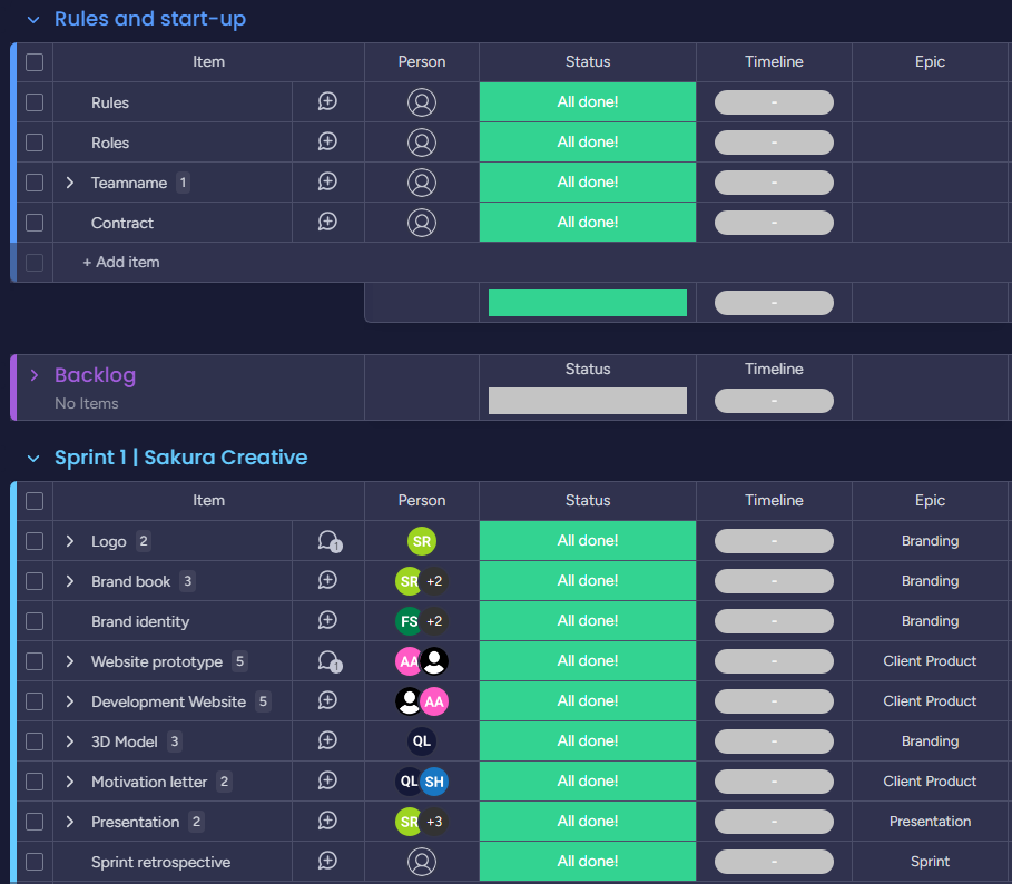
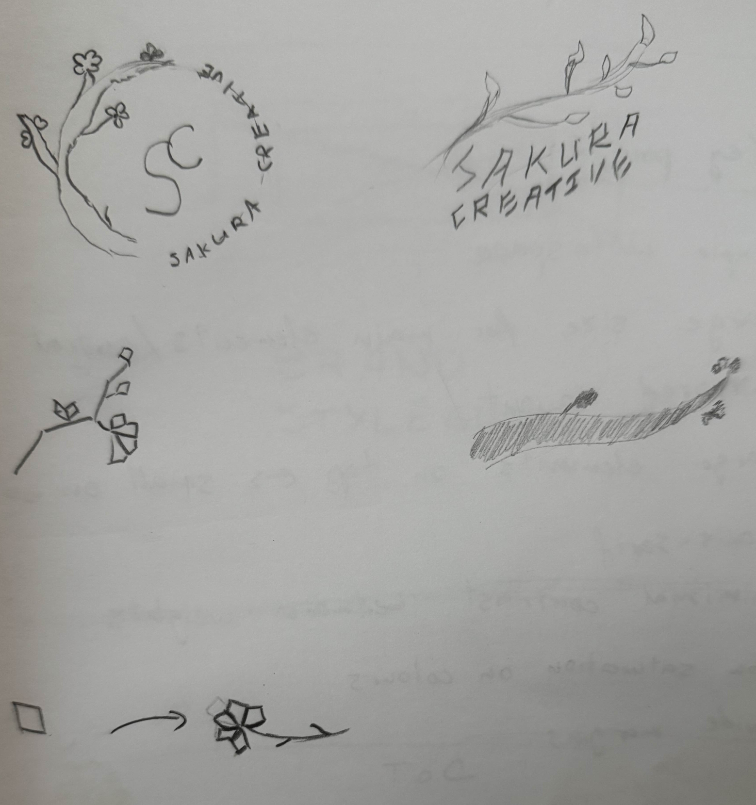
Logo
After we had the name, it was time to think of the logo. We decided that each member drew a sketch, and we could go from there. I made a rough sketch, but I couldn't really figure out something. The ideas that my teammates had were better so we went with their style.
During the design of the logo, I was mostly working on giving feedback for my teammate who was making it. I also did some research on how we could go about designing it, so I looked for inspiration online. It helped us agree on some colors, and the idea with the tree.
Brand Identity
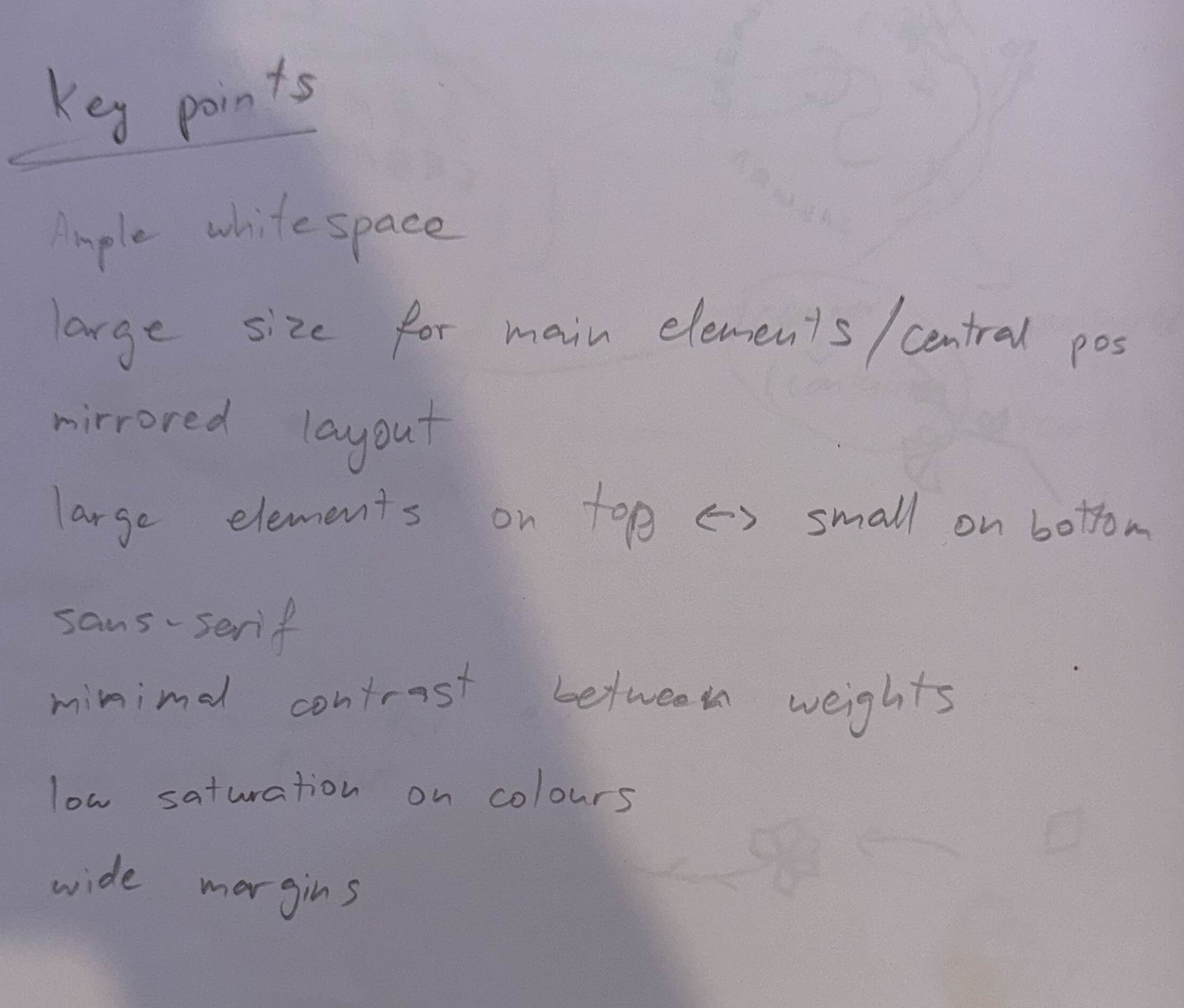
The main thing in the first phase was to also create a cohesive brand identity. I took that task on. Since I was already quite into the Sakura, and Japanese design, I thought I could come up with something which all of us could like and it was actually what we wanted. The ideology was that as a company, we wanted to be the spot away from all of life's chaotic things. A place to relax and enjoy the harmony and mindfulness. Our designs wanted to convey that. We were going to achieve that by clean, clear, simple, minimalistic, but modern Japanese aesthetics.
In order to achieve that we also had to research Japanese design and Japanese culture. I looked at some examples and took inspiration from Japanese architecture, music, and some websites. I found that the websites were a bit all over the place. Since Japanese is quite different than English, their websites we mostly a bit complicated and hard to navigate. That's why we found our inpspiration from architecture, and specifically, I liked the following website. It was exactly what we had in mind.
We also had Amer come and challenge our ideas and why we wanted to design it that way. He asked us things like why simplistic and not something extraordinary? Why we should have a logo that looks like a tree? And what would we do if a client didn't want that?
We managed to answer those questions confidently, according to our perspective outlined in the brand identity. And we also told him that if someone didn't like what we were doing, we basically weren't a good match. He was quite fond of our approach and shared his feedback.
After writing this document, I realized how important it is to actually knwo how and why we are doing something. Even the smallest thing needs to have a reason. Then it gains value and people understand and like it more, because they can connect it to a feeling, or an ideal, or a reason.
Brand Book
The next thing I did with Sanne was the brand guide. It included our logo, typography, and how our branding should or shouldn't be used in what situations. We worked on this for quite a bit, got feedback from our teachers and it came out very good.
To create that, we first gathered some inspiration on dribble and behance. It was the starting point of deciding what style to go for.
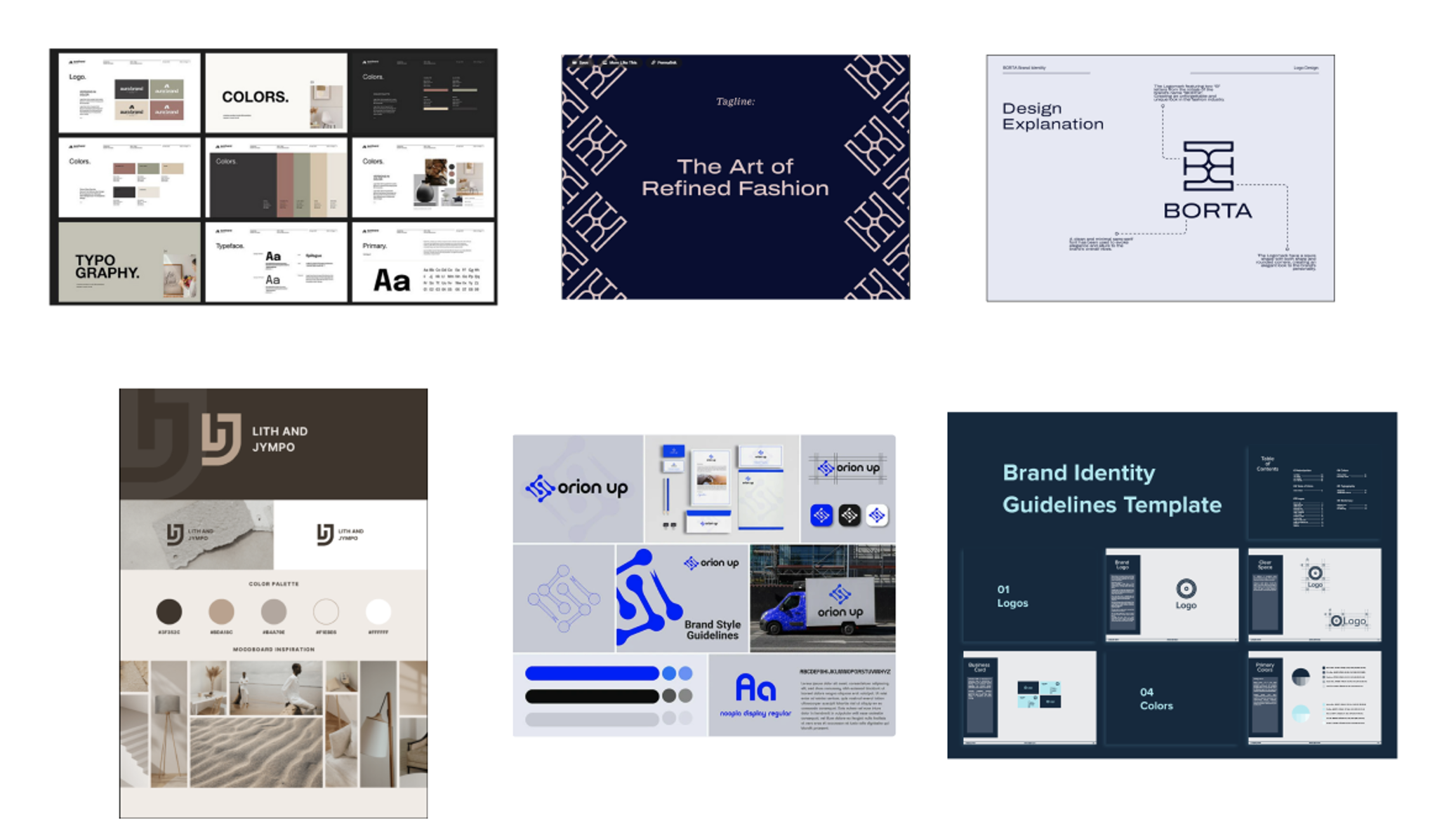
After that I created some sketches of the pages of the brand book. I followed some pages from other design guides that I liked, and tried to create both different types of designs and layouts, but some which were cohesive so we could use them later. Please, take a look at them on the right.
After I was done with sketching these out I talked to Sanne and we decided what style we'd go for. Then she created the first iteration of the brand book. After that I gave her my feedback on what I think of that, and I got some of the pages to both complete and iterate on.
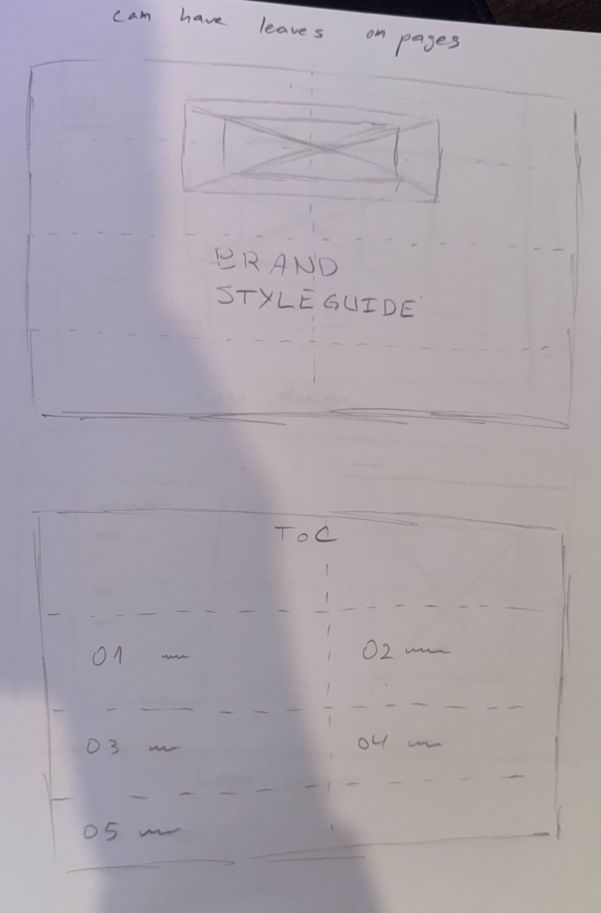
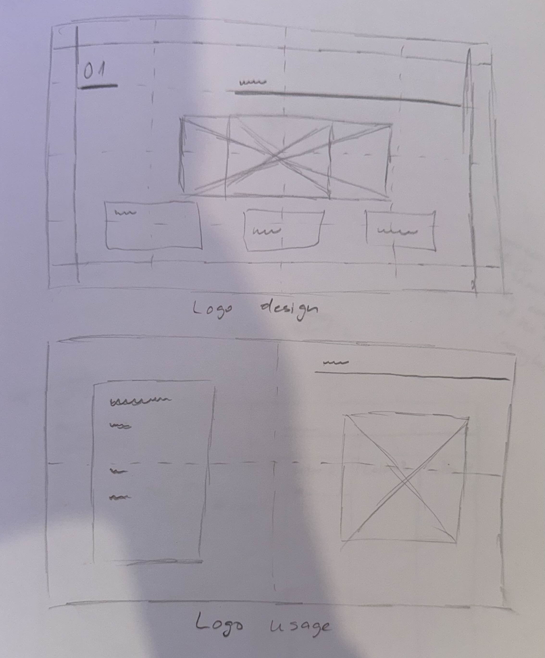
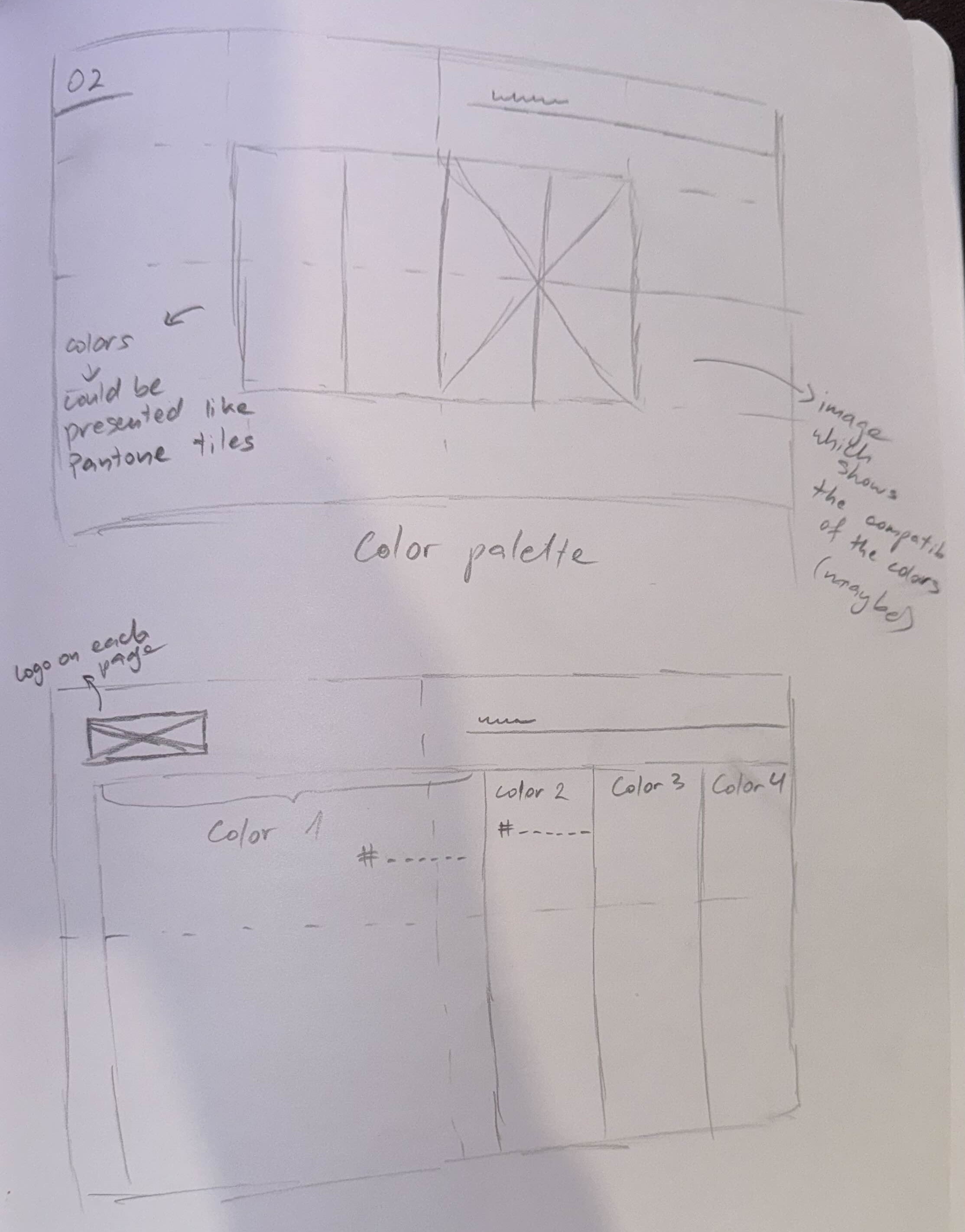
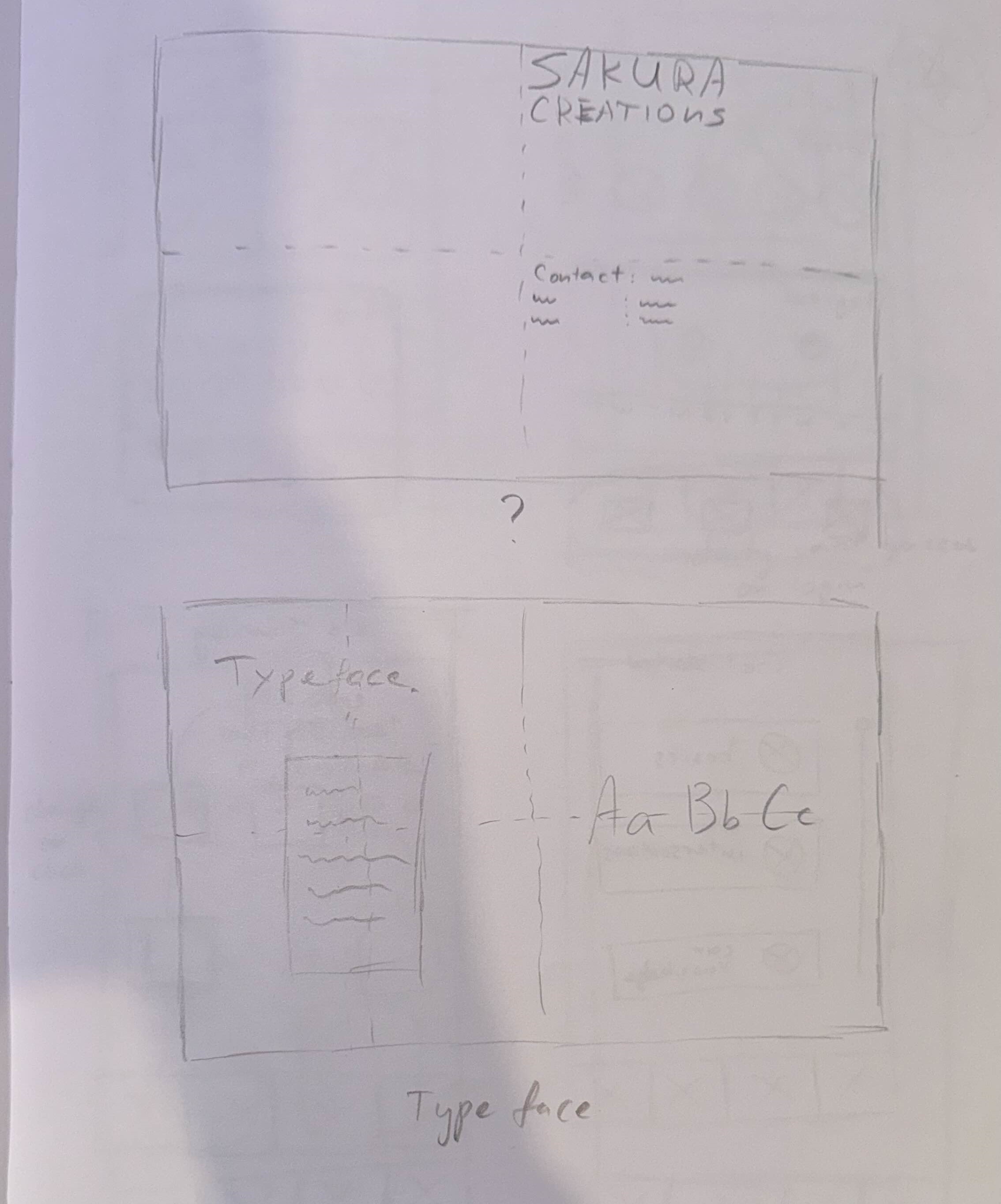
Brand Book - my pages
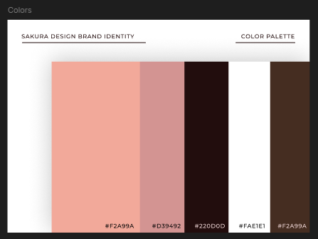
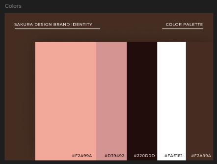
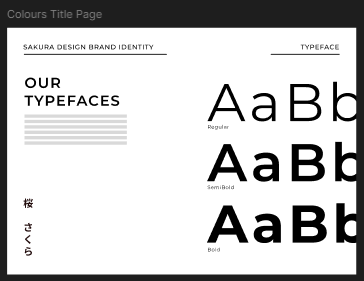
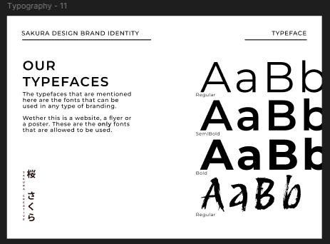
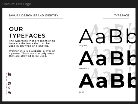
In the brand book I took about half of the pages so the workload would be equal between the 2 people who were making it. Pages that I took were the title pages, the color page, the typography and the logo usage.
When asking for feedback we did it with Sanne, since it's one product. We always communicated and asked if we think an iteration is ready for feedback and if we liked it. It was very nice and helpful to have worked with someone together. Someone who could genuinely give good feedback when designing.
Some iterations include:
- Missing colors in the overall design - Stan showed us his branding book and it had different colors for the title pages only. We liked that and incorporated that idea to our design. The colors we chose after long considerations and experiments were purple/pink. We were very satisfied that we tried colors.
- Dirk pointed out that people wouldn't know what the Kanji signs would mean and he suggested we added English so people can understand what we're trying to say. It was a small, but important addition to the design.
Final Product
The last thing I did was to make sure to add all the necessary text, make sure that everything was as it should be, and gather all the pages in a document so we could use it to send to companies.
After everything we did, all the brainstorming, sketching, designing, iterating, I believe we ended up having a really good final product - the brand guide. It also helped me grow as a person to have worked on something like this with someone experienced who could help me improve. It also proved to me how fun it is to do something with someone, as it also helps alleviate the pressure of a task.

Interactive media products
Transferable production
Creative iterations
Professional standards
Personal leadership